


Gmail Meter is an Apps Script which runs on the first day of every month and sends you an email containing different statistics about your Inbox. In a similar way to how recently introduced Google Account Activity gives key stats about how you’ve used your Google Account, Gmail Meter gives you different types of statistics that will help you analyze your Gmail habits.
But that doesn’t have to happen to you. Google has released information about a new feature called Gmail Meter on its blog. What does it do?
Basically, it breaks down all of your Gmail activity, telling you:
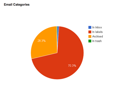
- Email Categories tells you how you are managing your Inbox. In the pie chart below, you can see that the majority of my emails are labeled. My Inbox is tiny compared to other labels which indicates that I keep a lean and mean Inbox.
- How many unread messages are in your inbox.
- How long it takes you on average to respond to emails.
- Whom you correspond with most often.
- What time of day you send the most emails.
Plus a host of other statistics, all organized in a spreadsheet.
Setting up your own report is pretty easy. First, go to Google Docs and create a new spreadsheet. Then go to “Tools” and select “Script Gallery.” Search for Gmail Meter and then install it. Google Docs will then ask for access to your Gmail account; give it the okay and you’re set. Just wait for the email saying the report is ready and then go check it out.
The pure volume of email going in and out of my Gmail account is pretty amazing, which is why a report like this is so helpful. For example, knowing when people are trying to reach me helps me know when I should be near my computer and when it’s okay to take a coffee break. Also, I like how I can rank my friends by who emails me the most, adding the loser to crazy conspiracy email chains from my distant relatives.
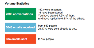
- Volume Statistics show you the number of important and starred messages, the number of people who sent you emails, and more. Volume statistics can be very useful in determining how you are using email efficiency tools like Priority Inbox.
- Daily Traffic gives you an estimate of when you receive messages and when you send them during a given month. For example, in the graph below you can see how the peaks in my “Sent” curve indicates that I write emails in spurts.

- Traffic Pattern lets you get a sense of your overall email activity over the past week.

- Time Before First Response shows you how long it takes you to reply, and how long it takes others to reply to you. By looking at this chart, I can infer that I reply faster than others I communicate with.

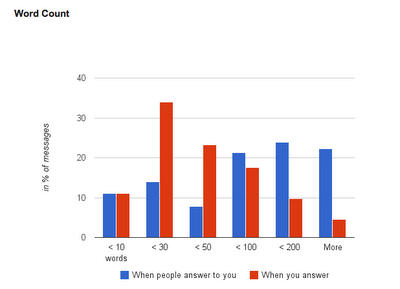
- Word Count tells you whether you are writing long emails. The example below shows that most of my emails are shorter than 200 words.
- Thread Lengths help you understand whether you participate in long conversations resulting in long threads. Top Senders and Top Recipients help you identify who you communicate with more frequently.
How to Setup Gmail Meter
Learning about my email habits has helped me become more email efficient. So, before you read that next article on "Writing Effective Emails," be sure to learn more about your own email habits using Gmail Meter.


No comments:
Post a Comment